Case Studies
The Card That Opened Doors: A Founder's Electroplated First Impression
When architect Aryan Mehra handed over his electroplated gold business card, something shifted in the room. This is the story of how craft changed his conversations.
The Moment the Room Changed
The meeting had been going well enough. Aryan Mehra, founder of the Jaipur-based architectural practice Mehra Form Studio, had walked the prospective client through three years of built work, a portfolio of residences and boutique hotels that spoke quietly of restraint and precision. The conversation was cordial, professional, politely noncommittal. Then, as the meeting wound toward its close, Aryan slid his business card across the conference table.
The client, a developer who had built luxury hospitality properties across Rajasthan and Gujarat, picked it up. He turned it over once. Then again. His thumb moved across the raised surface of the logo, a geometric rendering of an arch that Aryan had spent two weeks refining with a calligrapher friend before committing it to metal. The developer did not say anything immediately. He simply set the card down with the care one reserves for objects that deserve it.
"I will call you next week," he said. He did.
What a Card Has to Carry
Aryan had spent the better part of a decade building a practice that operated at the intersection of heritage craft and contemporary architecture. His projects were not fast or cheap. They were considered, layered, built with materials that aged beautifully. The problem, as he described it to us when he first came to Chhapai's atelier in 2021, was that nothing in his existing brand touchpoints communicated that philosophy before he opened his mouth.
"My website is good. My portfolio speaks for itself once someone is looking at it. But that first moment, when you hand someone a card at a preview or a dinner, that is the first physical thing they associate with you. If it feels ordinary, they assume ordinary."
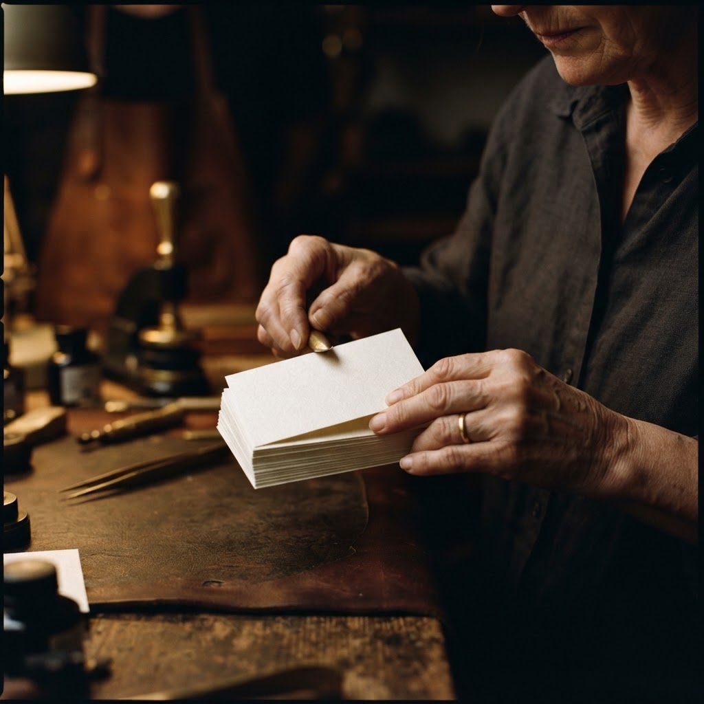
He had tried the usual routes. A thick cotton card with letterpress. A minimal linen-finish design. Both were fine. Neither was right. The cotton card felt artisanal but lacked authority. The linen card looked corporate. Neither held the specific tension his practice occupied, between the ancient and the precise, between warmth and exactitude.
What he needed was a card that felt like it had been made the way his buildings were made. Slowly, deliberately, with methods that left their mark on the material itself.
The Making of an Electroplated Card
A Process That Cannot Be Hurried
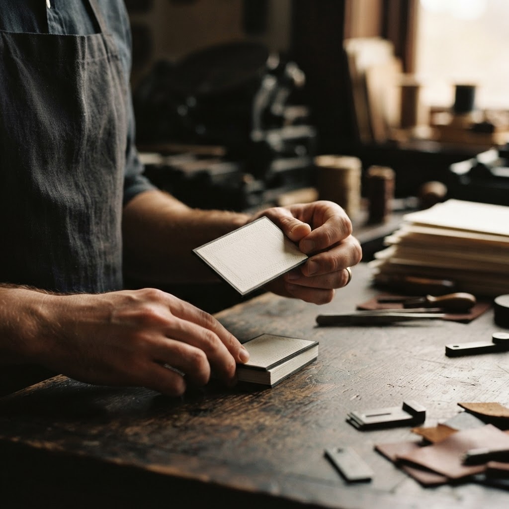
Electroplating, in the context of business card production, is not a finish applied at the end of a process. It is a process entire unto itself, and at Chhapai's Jaipur workshop, it occupies its own space and its own unhurried rhythm.
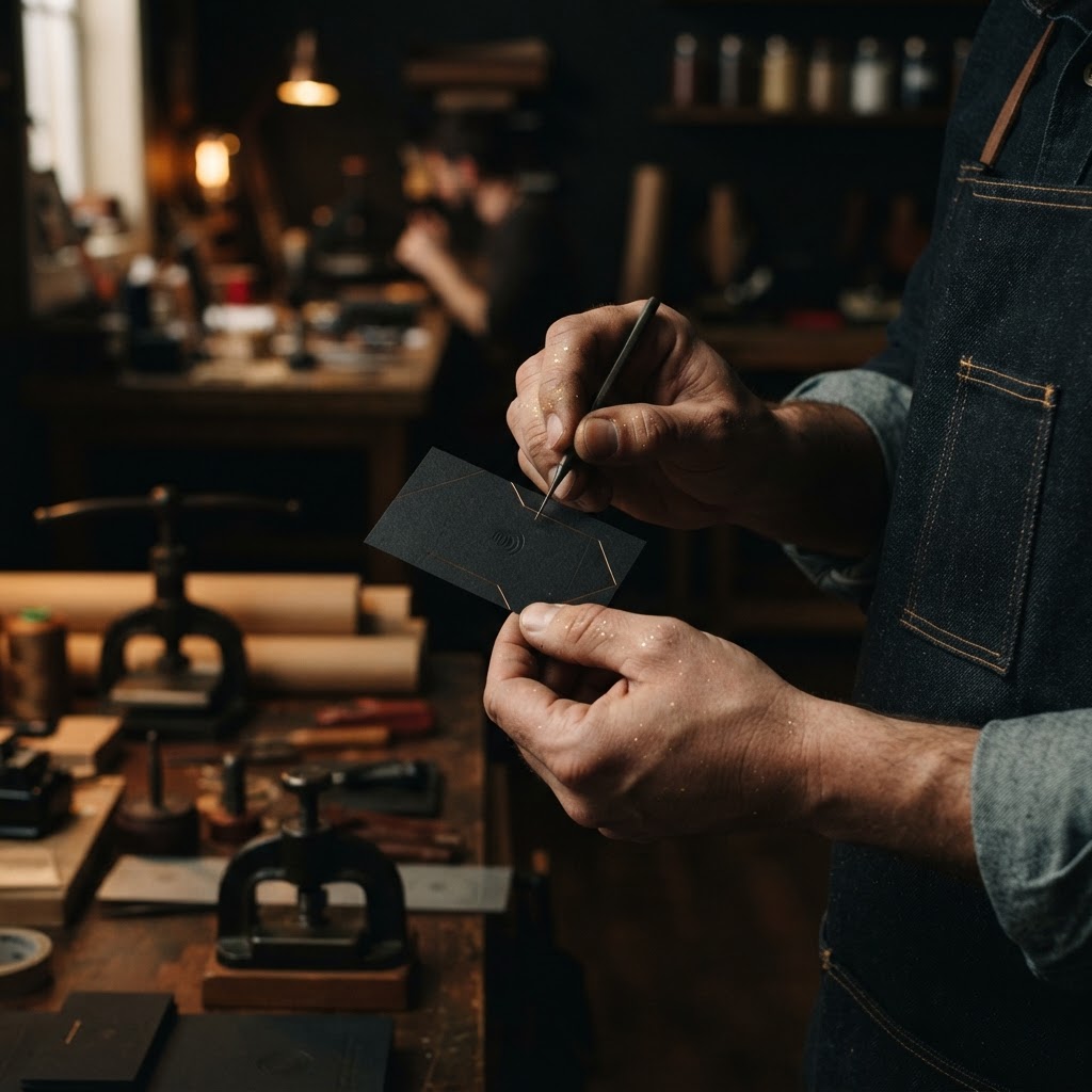
The technique begins with the design. This is where the first and most important constraint of electroplated work must be understood clearly. The process produces what is technically described as a metal cut embossed gold plated surface, raised relief work in custom metallic colour, applied with a precision that catches light at angles that printed foil simply cannot replicate. It is genuinely, visibly three-dimensional. Run a fingertip across it and you feel the architecture of the image before you see it.
But this physicality comes with a requirement. The detail that can be held in electroplated relief is substantial at the scale of a logo, a monogram, a bold geometric form. It is not suited to fine typography, small point sizes, or intricate linework below a certain threshold. The process rewards boldness and punishes delicacy. A complex logomark rendered in electroplated gold will glow with authority. A name set in a light-weight serif at eight points will lose legibility in the raised surface.
This is not a limitation so much as a discipline. It asks the designer and the founder to make a decision about hierarchy. What, on this card, is the most important single visual element? Whatever the answer is, that is what electroplating will honour.
Custom Colour and the Question of Gold
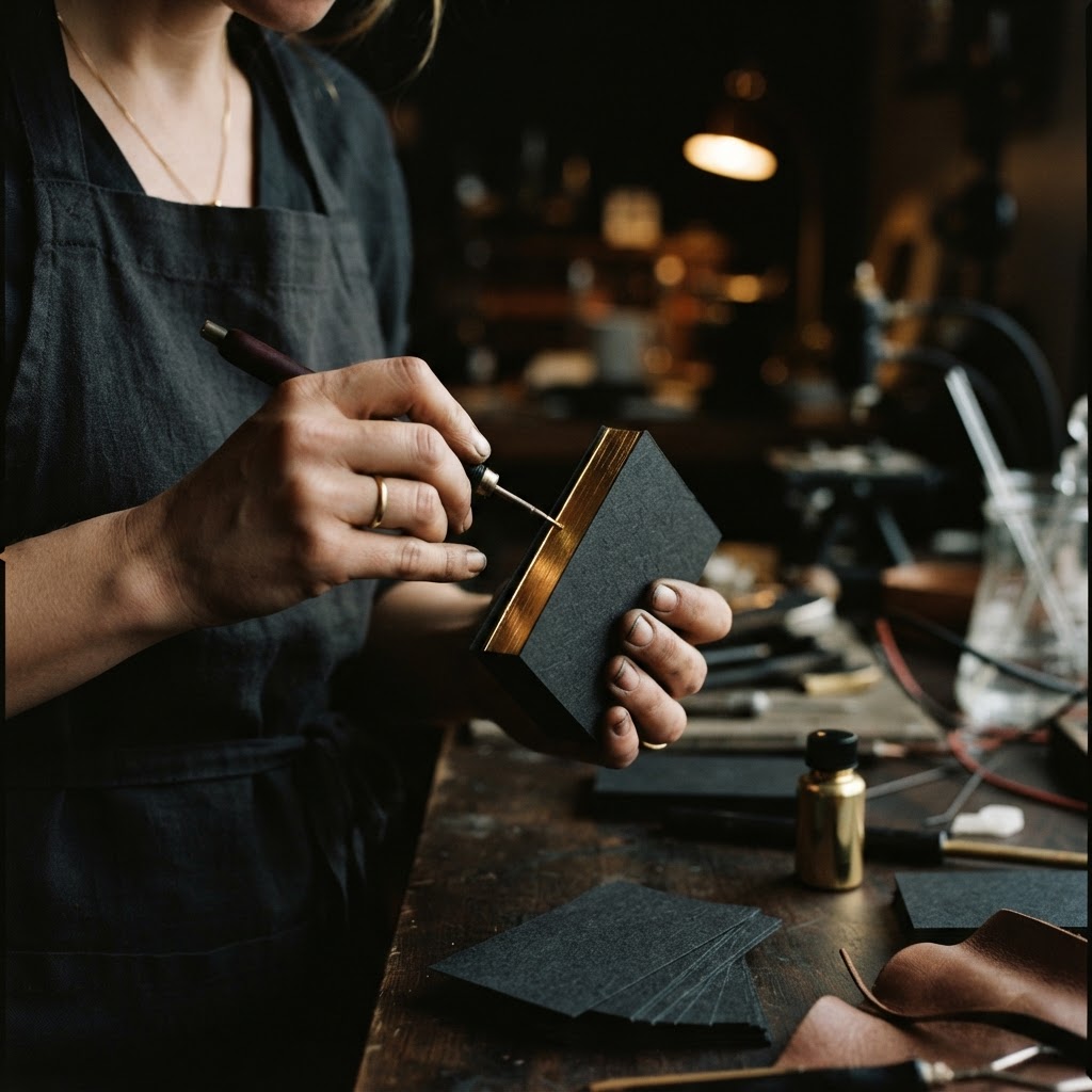
The custom colour capability at Chhapai means that the metallic palette is not restricted to standard gold or silver. Clients work with our production team to arrive at a specific hue within the plated spectrum, a warmer rose gold, a cooler champagne, a deep bronzed tone that reads differently under natural light than under the fluorescent lighting of a conference room. The colour is not merely decorative. It is communicative.
For Aryan, the decision was a particular shade of warm gold, not the brash yellow-gold of traditional embossing, but something closer to the tone of aged Dhokra brass, a colour he associated with the craft traditions his buildings drew from. The Chhapai team produced sample tiles across six variations before he settled on the one that sat right. He held each one near a window. He held each one under his desk lamp. He looked at them against the off-white card stock he had chosen for the base. The sixth sample was correct.
"When you find the right one, you do not deliberate. You simply know. It is the same feeling as when a material specification finally resolves on a drawing."
When the Card Does the Work
The first batch arrived at Aryan's studio on a Tuesday morning in March. He described opening the Chhapai box as unexpectedly moving, which is a strange thing to say about business cards, but not, perhaps, if you have spent years trying to make something that finally matches what you intended it to be.
The arch logo sat in raised gold relief against the card's surface, catching the studio light as the stack shifted in his hands. His name and contact details were set in a clean, moderately weighted sans-serif in warm grey on the reverse, the typography doing its job without competing for attention. The card had a weight and a warmth. It felt considered.
Over the following eight months, the cards did things that previous versions had not done. Clients at project previews asked where they had been made. A Mumbai-based interior designer who received one at a Jaipur design week event called three weeks later, not to discuss a project but to ask about the cards specifically, because a hotel developer she had shown it to wanted to know. That developer became a client.
A boutique hotel operator in Udaipur kept the card on her desk for two months before commissioning a residential project. When she finally called, she mentioned the card directly. "I kept looking at it. It felt like it understood something about materials."
Aryan noted something subtler too, something internal rather than external. He had always been confident in his work. But there is a particular steadiness that comes from knowing that every element of your presentation is doing what you need it to do. He described handing over the card now as a complete gesture, a moment where nothing needed to be explained or qualified. The card carried its own weight.
Referral as Craft
In luxury practice, whether in architecture, finance, hospitality, or any field where relationships are the medium of business, referral is the primary currency. And referral depends on memorability. Not the aggressive memorability of novelty, a gimmick recalled with mild amusement, but the deeper memorability of quality, something recalled because it was genuinely good and because goodness is rarer than it should be.
Electroplated cards, made well, with the right logo, the right colour, the right stock, occupy this second category. They are not tricks. They are simply objects that have been made at a standard the recipient can feel without being told to feel it. That sensation translates. It attaches itself to the person who gave it. It becomes, in the quiet way that brand works when brand is working properly, a part of how that person is remembered.
A Quiet Final Thought
Aryan Mehra still uses the same card design he arrived at in 2021. He has reprinted twice. He made one small refinement to the logo geometry after the first batch, a tightening of the arch's proportions that only he and perhaps one other person would notice. The card has been to Dubai and to London and to the dining rooms of four Rajasthan heritage properties that are now Mehra Form Studio clients.
He told us recently that he sometimes thinks about the developer who first turned it over in that conference room. "He was the kind of person who had been handed thousands of business cards. And he paused. That pause was worth every rupee and every conversation we had about gold tone and paper weight."
At Chhapai, we have been making cards in Jaipur since 2006. We have watched founders arrive with a frustration they cannot always name, a sense that their materials are not keeping pace with their work, and leave with something that finally does. The electroplating process is one of the slower, more demanding things we do. It is also, without question, one of the most rewarding.
Some things are worth the pause they create.