Case Studies
The Foil That Closed the Deal: A Founder's Mark of Authority
When Mumbai developer Aryan Mehta handed over his Chhapai foil-stamped card, the room changed. This is the story of a card that spoke before he did.
The Moment the Room Shifted
The meeting was on the thirty-first floor of a tower in Bandra Kurla Complex, the kind of room where everything is intentional: the low hum of climate control, the pale marble conference table, the view held just so. Aryan Mehta had been developing luxury residential properties in Mumbai for eleven years. He knew the weight of a first impression. He had prepared for forty minutes of conversation.
He did not expect the card to do it in four seconds.
When he slid his business card across the table toward the Singapore-based investment director, the man paused mid-sentence. He picked it up. He tilted it once toward the light, watching the gold foil shift from a deep amber to a bright, almost liquid gleam. He said nothing for a moment. Then he said, quietly, "This is serious work."
The conversation that followed lasted two hours. The partnership that followed changed the trajectory of Aryan's firm entirely.
What He Needed the Card to Say
Aryan had spent the better part of a decade building a reputation that lived mostly in the rooms he entered, in the handshakes and the site visits and the finished lobbies that spoke for themselves. His projects were meticulous. His interiors were sourced from Rajasthan and Milan in equal measure. His client list was private and earned slowly.
But paper, he admitted, had always been an afterthought.
"I had the same card for six years," he told us. "Cream stock, black type, a small logo. Clean. Forgettable. It told people I existed. It did not tell them what I stood for."
The gap between what his work communicated and what his card communicated had grown quietly, invisibly, until a collaborator said something plainly honest over dinner: your card looks like a firm that is still figuring itself out. Your buildings do not.
That sentence stayed with him for two months before he called Chhapai.
"The card is the first object someone holds that belongs to your brand. If the object feels ordinary, they begin to wonder whether the brand is too."
The Craft Behind the Foil
A Process That Has No Shortcuts
When Aryan arrived at our Jaipur atelier, the conversation began not with paper samples but with questions. What is the feeling you want to leave in someone's hand? Not the message. The feeling. He described something ceremonial. Something with gravity. Something that felt, in his words, like a document rather than a calling card.
We brought out the foilpress samples. He ran his thumb across one before we said a word about the process, and he looked up.
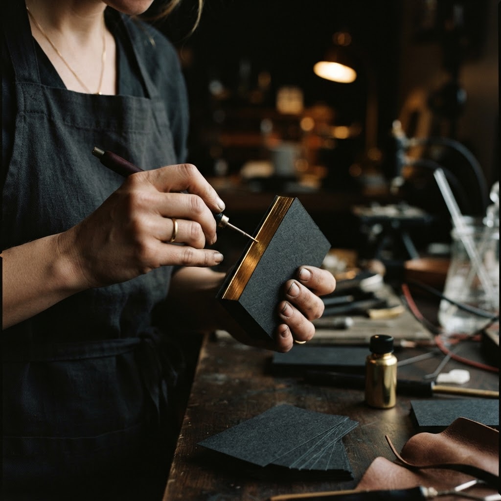
Foil stamping at Chhapai is a discipline that rewards patience and punishes haste. A metal die, engraved precisely to the contours of the artwork, is heated to a temperature calibrated for the specific foil and substrate in use. The foil, a fine metallic film held between two carrier layers, is pressed between the hot die and the paper under controlled pressure. In that instant of contact, the metallic layer releases and bonds permanently to the surface, leaving behind a reflective emblem of extraordinary clarity.
The result is not a printed metallic. It is not ink with shimmer mixed in. It is a physical deposit of metal, and you feel that distinction the moment you hold the card toward any light source. The edges are sharp. The surface is glassy. The surrounding paper, by contrast, absorbs light entirely, making the foil seem to float above the stock.
Gold, Silver, Rose Gold, and the Logic of Colour
For Aryan's cards, we spent nearly forty minutes with foil samples alone. Bright gold read as celebratory, almost festive. We wanted something more considered. We moved to a burnished gold, a deeper, richer tone that suggested heritage rather than announcement. It sat on the card the way a seal sits on a document.
The foil palette at Chhapai extends well beyond the classical trio of gold, silver, and rose gold. There are champagnes and bronzes, deep coppers and cool platinums, each carrying its own temperament. For a brand built on refined material choices, the foil colour is not decoration. It is a continuation of the design language.
For Aryan, the burnished gold against a deep charcoal cotton stock was decided quickly once we placed the two together. Some pairings announce themselves.
The Emboss That Elevates
We recommended the optional emboss beneath the foil, a technique that raises the logo fractionally above the card's surface before the foil is applied over it. The effect is subtle to the eye and unmistakable to the fingertip. The logo sits proud, like a royal seal pressed into correspondence. When someone runs their thumb across his name, they feel the architecture of the mark before they read it.
This is not a flourish added for its own sake. The emboss communicates, through the language of the hand, that this object was made with intention. In luxury contexts, where everything from a hotel check-in envelope to a watch box is considered, that intentionality reads immediately and correctly.
The foilpress card is chosen, for precisely this reason, by legacy brands, private developers, and leaders for whom stature is not something worn loudly but something carried quietly and recognised on contact. It is not the loudest card in the room. It is the one that gets set aside carefully rather than dropped into a pocket.
What Changed After the Cards
Aryan ordered three hundred cards. He told us, with a measured smile, that he had never been precious about business cards before. He became precious about these.
The Singapore meeting was the first proof. The second came six weeks later, when a Mumbai-based private wealth manager whom Aryan had met briefly at an event called to request a meeting. The manager mentioned, unprompted, that he still had Aryan's card on his desk. That he had shown it to two colleagues. That it had prompted the conversation they were about to have.
A card on a desk is a different thing from a card in a drawer. One is a reminder. The other is a decision to keep something because it carries meaning beyond its information.
"Three people called that card beautiful before they called it memorable. I had never had anyone call a business card anything before."
Aryan began noticing a change in the quality of conversations at first meetings. Not their content, exactly, but their register. The card seemed to calibrate the room. It set a tone of seriousness and deliberate craft that Aryan's work had always embodied but that, until now, had taken time to establish. The card shortened that distance considerably.
Referrals, he noted, became more specific. Where once a contact might say "I know a developer you should meet," they now said "I gave your card to someone and they called me the same afternoon." The card travelled. It introduced him in rooms he had not entered yet.
His firm, Mehta Heritage Developments, updated every branded touchpoint in the eighteen months that followed: letterheads, envelope liners, presentation folders. All informed by the same design vocabulary that the foilpress card had established. The card did not simply communicate the brand. It became the reference point from which the brand was rebuilt.
A Mark Is Not Made Once
There is a tendency, when discussing printed materials, to frame them as static objects. A card is printed, distributed, received, filed or discarded. The story ends there. What Aryan's experience points toward is something more continuous.
Every card he gave out was an act of authorship. It said, without words: I considered this. I chose the weight of this stock and the temperature of this gold and the depth of this emboss deliberately. I considered what you would feel when you held this. That consideration is not separate from the work I do. It is the same work, expressed differently.
At Chhapai, this is what we have understood since 2006. A business card is not a utility. It is the smallest complete expression of a brand, which means it requires the same rigour, the same material honesty, the same attention to the sensory experience that a serious founder brings to everything else they build.
The foil catches light differently at every angle. That is not an accident. It is the point. A mark of authority should never look exactly the same twice. It should reward the act of looking closely.
Aryan's card still sits on a desk in Singapore. We like to think it is still catching the light.