Case Studies
The Card That Spoke Before She Did: A Founder's Letterpress Story
When architect Priya Mehta handed her letterpress card to a Mumbai developer, the silence that followed changed everything about how she pitched her work.
A Moment of Stillness in a Crowded Room
The meeting was on the thirty-first floor of a tower in Lower Parel, the kind of room where every surface is glass and every person is performing confidence. Priya Mehta, founder of Mehta Spatial Studio, had flown in from Ahmedabad with a portfolio on her tablet and twelve cards tucked into the inner pocket of her blazer. She had used those cards maybe a hundred times before. But not like this.
When she slid one across the table to Rakesh Oberoi, the developer behind three of Mumbai's most discussed mixed-use projects, he picked it up and did not put it down. He turned it over. He pressed his thumb into the surface where her name sat, pressed into the cotton paper with a depth you could feel before you could explain it. He looked up. "Where did you get this made?" he asked. Not: tell me about your firm. Not: what is your day rate. Where did you get this made.
Priya had an answer, and that answer became the first real conversation of what would become a three-year engagement.
What She Needed to Say Without Words
Mehta Spatial Studio was, at the time, six years old and quietly exceptional. Priya had trained in London, worked briefly in Tokyo, and returned to India with a philosophy about space that was harder to explain than it was to experience. Her work was tactile, considered, rooted in material honesty. She believed that the surfaces people live among carry emotional weight. A rough-hewn wall. A smoothed concrete floor. The grain of reclaimed teak under a skylight.
Her business cards, until 2021, had been offset-printed on a standard 350 gsm stock. They were fine. They were forgettable.
"I was asking clients to trust me with their most significant spaces," she said, sitting across from me at a café near the Chhapai atelier in Jaipur, her hands wrapped around a small clay cup of chai. "And then I was handing them something that could have come from any print shop in any city. There was a disconnection I couldn't keep ignoring."
She needed a card that did what her architecture did. That communicated before it explained. That had, in her word, presence.
The Craft Behind the Impression
What Letterpress Actually Is
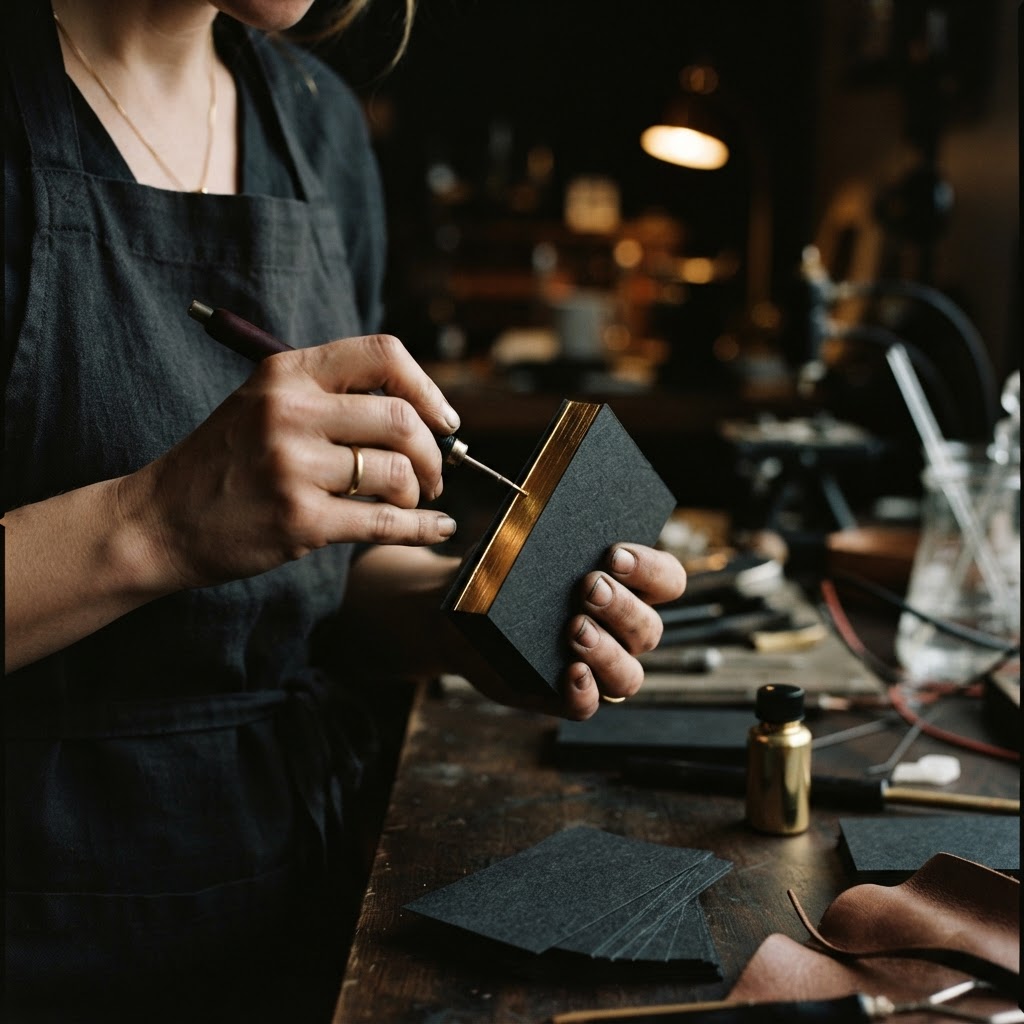
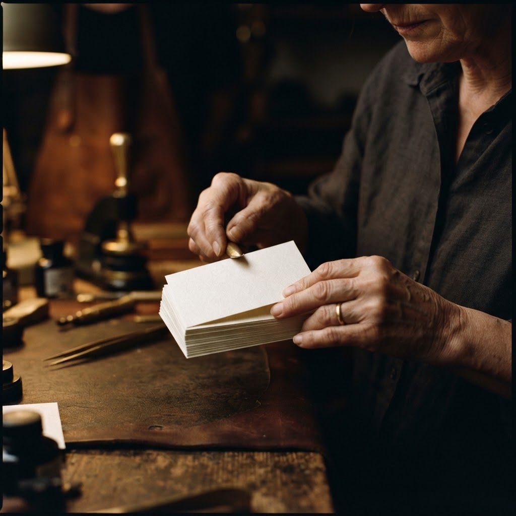
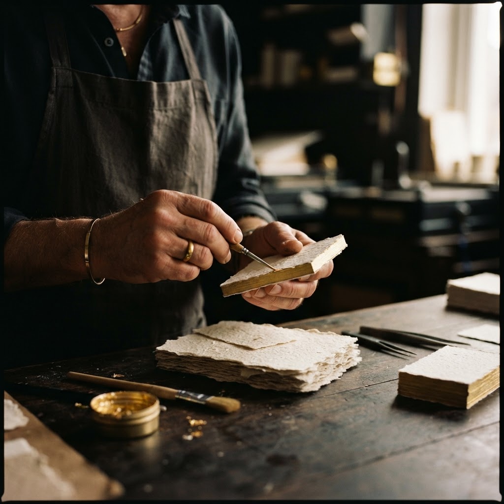
Letterpress is one of the oldest printing techniques still practiced with genuine intention, and at Chhapai it is practiced with a specificity that takes years to develop. The process begins with the selection of paper, and here the choice matters more than most clients initially understand. Cotton paper, milled with a natural tooth, a slight give, a surface that accepts pressure without cracking or resisting, is the foundation on which everything else depends.
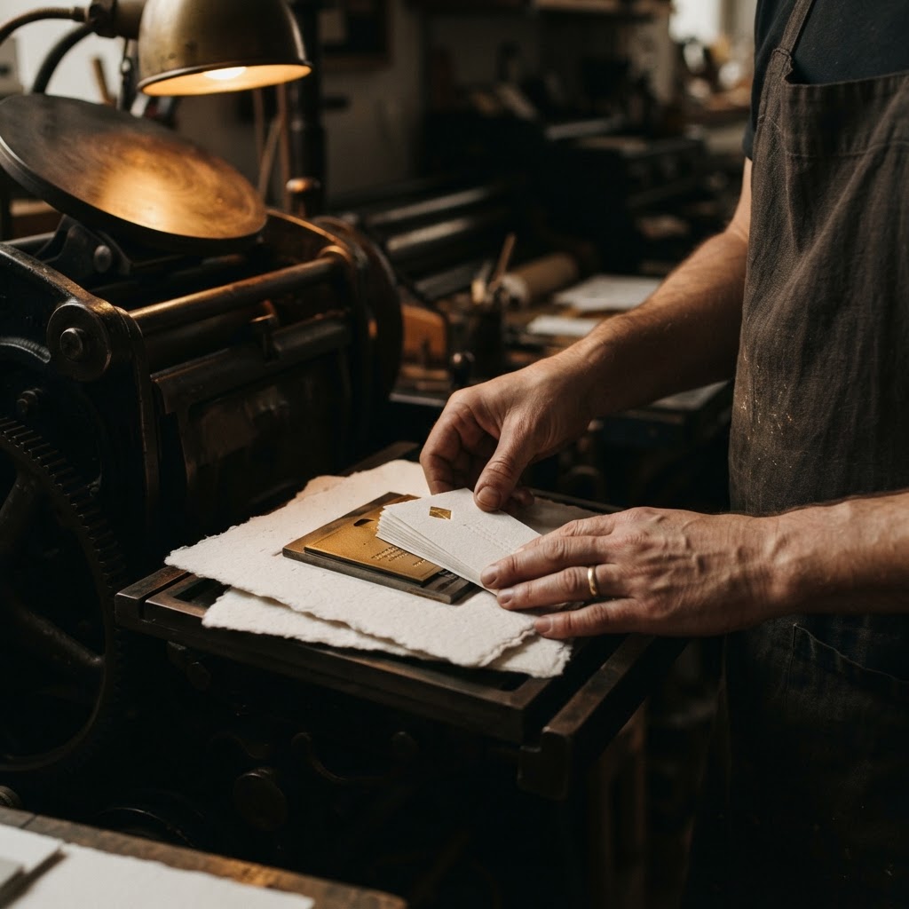
The type or design is set, traditionally in metal or photopolymer plate, and inked. Then the press descends. This is the defining act: not a transfer of ink onto a flat surface, but a genuine impression, a depression driven into the body of the paper itself. The result is a debossed texture you can trace with a fingertip, a topography of meaning pressed into a card that will survive years in a wallet and still carry that original mark.
Letterpress is a deep impression printing technique for authentic, artisanal texture. The ink does not simply sit on the surface. It enters the material, and the material holds it.
At Chhapai, no two letterpress runs are identical. The pressure is calibrated by hand. The ink density is read visually by craftsmen who have spent years learning what the correct colour looks like under the atelier's specific light. A card passes through multiple stages of inspection before it reaches a folio, and the folio before it reaches you.
Priya's Specific Brief
When Priya first visited the atelier in late 2020, she brought a swatch of the plaster finish she had used on a residential project in Vadodara. A matte, pale, almost mineral surface. She wanted her card to carry a similar quality. Calm. Dense. Something that made you slow down.
The team at Chhapai selected a 600 gsm double-thick cotton stock, the kind that does not bend easily, that sits in the hand with a solidity usually reserved for much larger things. Her name and studio mark were set in a single typeface, a fine-weight grotesque, pressed into the surface with enough depth that you could feel the letters from the reverse side. No foil. No embossing. Just the impression and a single ink colour, a warm off-white on natural unbleached cotton, barely there but unmistakably present.
"I kept asking them to make it quieter," she said. "And they kept understanding exactly what I meant."
What Changed After the Cards Arrived
The first box arrived by courier in a slim kraft sleeve, packed between sheets of tissue. Priya opened it at her studio desk, alone, on a Tuesday morning. She picked up a card and held it the way you hold something you are not sure you want to put down.
The change was not dramatic. It was cumulative, and it was real.
She began noticing that people took longer to look at the card before looking back at her. In pitches, the card would remain on the table rather than disappear into a pocket or a bag. Twice in the first three months, potential clients brought her card to a second meeting, held between two fingers like a reference point, a small physical anchor for the conversation they had come to continue.
The Mumbai meeting with Rakesh Oberoi came eight months after the cards arrived. He later told her, over dinner after the contract was signed, that he had shown her card to his wife, an art collector, who had asked if it was a print from a gallery. He had meant it as a compliment of the highest order, and Priya had received it as one.
"A card that someone shows to someone else is no longer just a card. It has become an introduction you were not present for."
Referrals followed a different shape now. Rather than cold introductions, people arrived already carrying a small amount of trust, already having held something that told them something true about how Priya worked and what she valued. The card had done a portion of the relationship-building before the relationship had begun.
On Brand Confidence
There is a subtler thing that happened, and Priya spoke about it carefully. "I became more confident in meetings," she said. "Not because the card made me more impressive. But because I was no longer handing over something that contradicted what I was saying. Everything was consistent. The work I showed, the way I dressed, the way I spoke, and then the thing I left behind. It all came from the same place."
This is perhaps the least discussed benefit of investing in the physical materials of a brand. Not the external perception, though that matters, but the internal alignment. The quiet certainty that comes when your tools match your values.
The Thing That Stays
Chhapai has been making letterpress cards in Jaipur since 2006, and in that time the founders have watched the business card be declared dead with some regularity. Each declaration has proved, in practice, to be wrong, and perhaps nowhere more clearly than in the worlds of architecture, design, hospitality and luxury goods, where the physical object is still understood to carry meaning that a digital contact exchange cannot replicate.
Priya Mehta's cards are now in their third iteration. The stock remains the same. The impression remains the same. She has added, in the most recent version, a very fine blind deboss of a small geometric mark on the reverse, so subtle that it only reveals itself when the card is held at an angle to the light. Most people never notice it. Some people do, and when they do, they look up at her with a particular expression.
That expression is the whole point.
A card made with genuine craft does not announce itself. It waits to be discovered. It rewards attention. It behaves, in other words, exactly the way good architecture behaves, exactly the way any work of lasting quality behaves. It does not ask to be admired. It simply endures, and in enduring, it speaks.