Case Studies
The Card That Whispered Louder Than Any Pitch Ever Could
When Meera Sethi handed over her first Chhapai Wrapping Sheet card, she didn't say a word. She didn't need to.
The Moment Before the Meeting
The conference room on the fourteenth floor of a Bandra high-rise was the kind of place that rewarded confidence and punished hesitation. Meera Sethi, founder of Luminal Studio, a Mumbai-based creative consultancy that dressed luxury hospitality brands in visual identity, had been in rooms like this before. She knew the choreography. The firm handshake, the brief nod toward the view, the laptop propped open to the deck she had spent eleven nights refining.
But that afternoon, something happened before she opened her computer at all.
She placed her card on the table.
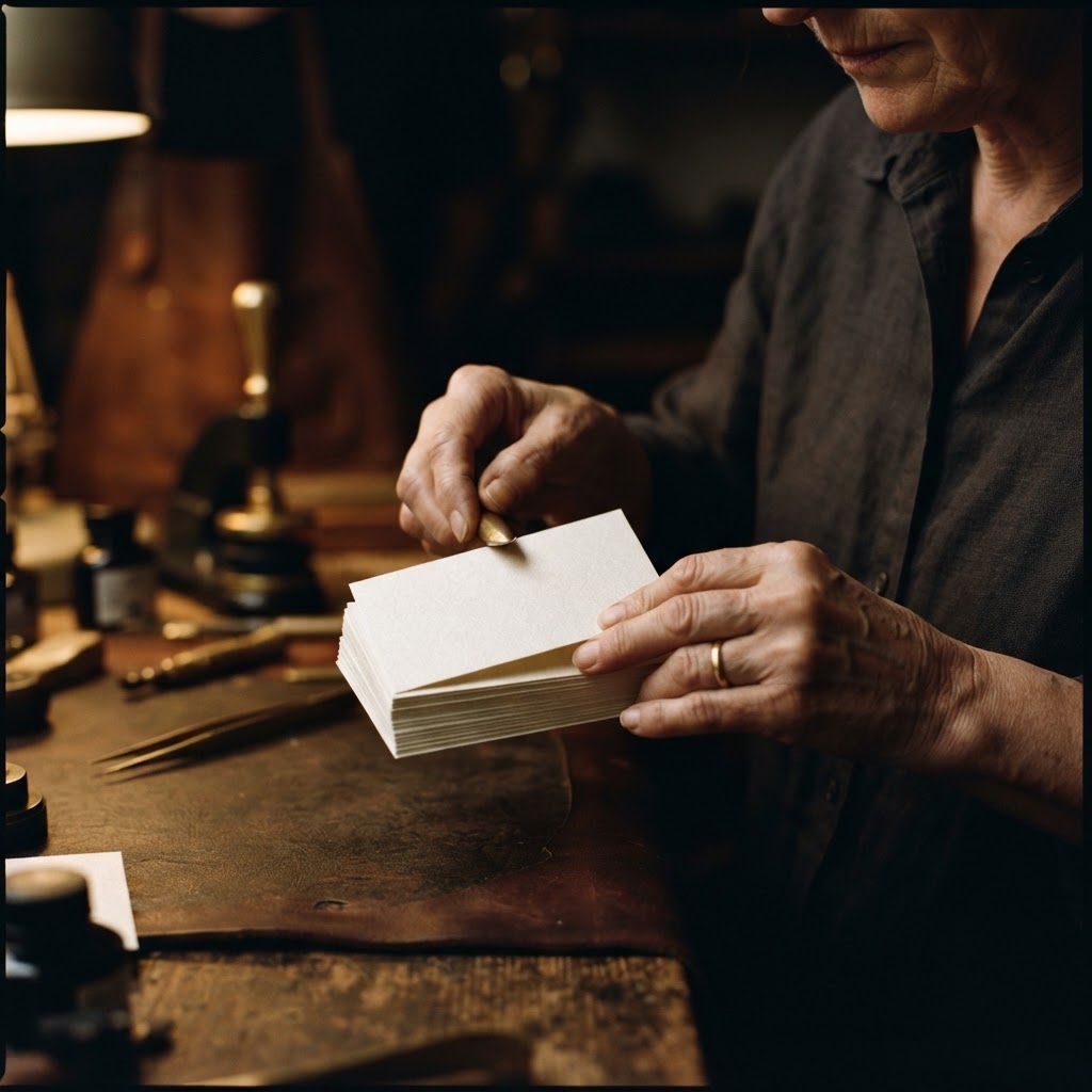
Her prospective client, the director of a heritage hotel group with properties in Udaipur, Coorg and Pondicherry, reached for it without being asked. He held it up, slightly, so the afternoon light from the window passed through it. The card caught that light and softened it, distributing it in a quiet, diffused glow. He turned it over once, ran his thumb across the surface, and said, almost to himself, "This is exactly the kind of thing we want to feel."
They signed the contract three days later.
What a Card Is Really Carrying
Meera had built Luminal Studio over six years on a single conviction: that the most powerful luxury experiences are not announced, they are felt. Her clients were not interested in loud gestures. They were interested in the quality of silence between gestures. The hush of a well-appointed corridor. The weight of a hand-stitched menu. The particular temperature of linen that has been laundered exactly the right number of times.
Her work was about subtlety as a form of authority. And for years, her business card had quietly undermined that message.
She had tried the obvious routes. Thick cotton cards with blind embossing, matte black with spot UV, even a brief and regrettable period with rounded corners and a silver foil logo that caught light the way a disco ball might. None of them felt like Luminal. They felt like a version of luxury that borrowed its grammar from someone else's vocabulary.
"I kept asking myself what the card would feel like to someone who had never heard of us," she told me, sitting in her Bandra studio, a single stem of dried pampas grass in a tall clay vessel behind her. "And the answer kept being: like effort. Like trying. I didn't want trying. I wanted inevitable."
She found her way to Chhapai through a wedding designer in Delhi whose stationery suite had stopped a table of guests mid-conversation at a Mehendi dinner in Jaipur. The designer had used something Meera had never encountered before. A paper that seemed to hold light inside itself rather than reflect it.
The Material Itself
Sheer Sophistication, Rendered in Paper
At the Chhapai atelier in Jaipur, the paper is called Wrapping Sheets. The name gestures at its origins in the language of layering, of enclosure, of the reveal as a deliberate act. But to call it simply a paper would be to misunderstand what it does in your hands.
Wrapping Sheets is translucent. Not transparent, not opaque, but something precisely in between. Its surface is frosted in character, the way sea glass holds colour without quite being either glass or water. It diffuses light rather than redirecting it, which means that when you hold it near a source of illumination, the light seems to emanate from within the sheet rather than bounce off its face. The effect is quiet and entirely deliberate.
The surface has a smoothness that is different from coated stock. There is no slick resistance, no glassine quality that keeps a finger from settling. It is soft in the way a whisper is soft, present and intimate without demanding anything back. Light as air, the team at Chhapai says, and the description earns its poetry.
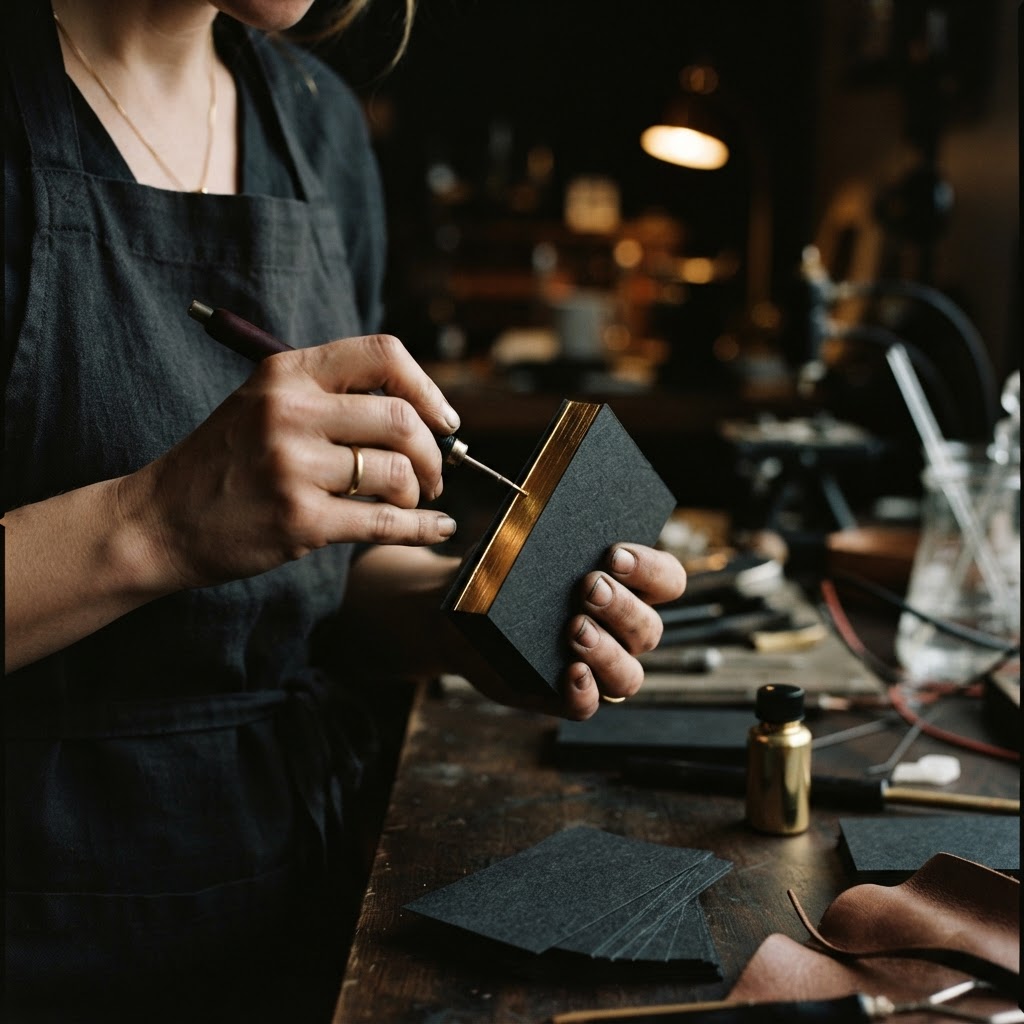
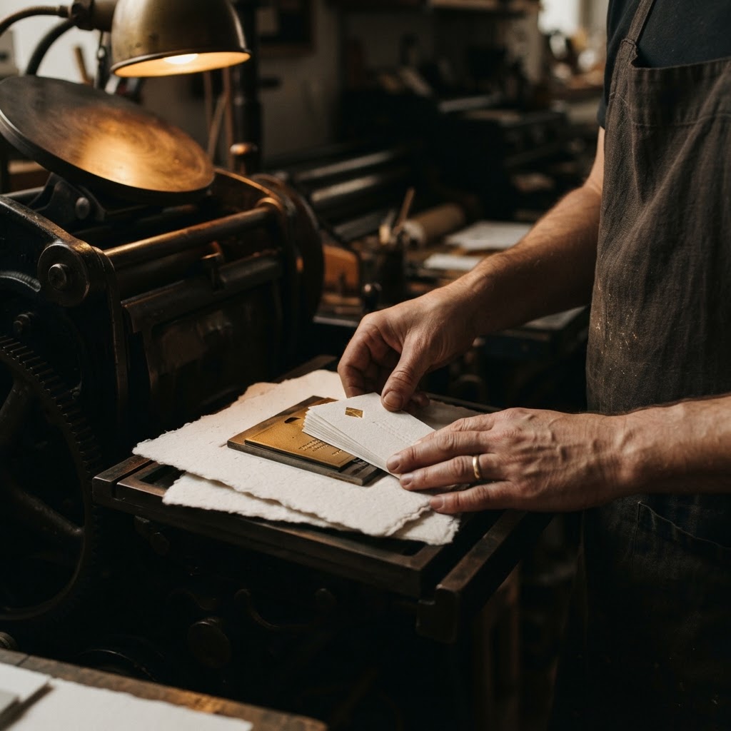
When letterpress printing is applied to Wrapping Sheets, the process requires a particular kind of patience. The translucency of the stock means that every ink choice, every impression depth, every margin decision becomes legible in a way that more forgiving papers conceal. White ink on Wrapping Sheets does not sit on the surface so much as it seems to surface from within it. The frosted clarity of the sheet allows a soft foil to glow rather than glare, to suggest rather than announce.
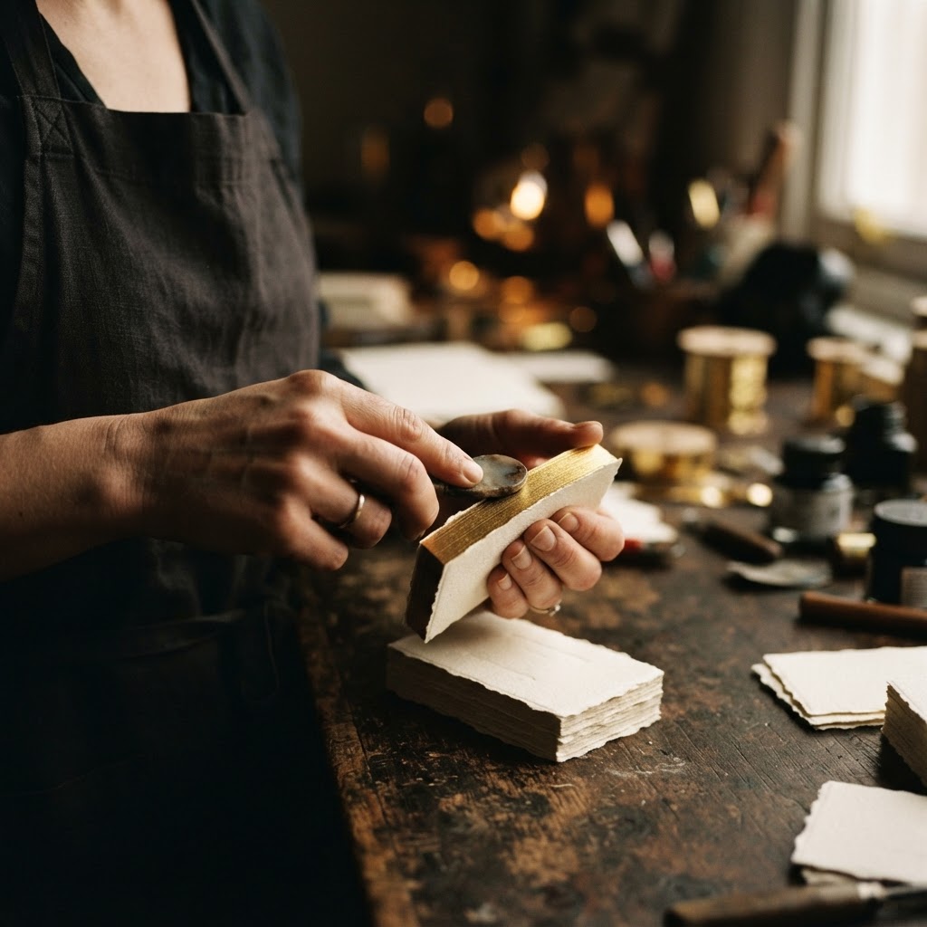
The Chhapai craftsmen who work this stock understand that the material is not a background. It is a collaborator. Minimal typography pressed into its surface reads the way a phrase reads when spoken at exactly the right volume. You lean in to receive it.
Designed to Layer
Wrapping Sheets comes into its fullest expression when used in combination. As an overlay on a heavier card, it introduces dimension without competition. The sheet above does not overpower what is beneath it. It softens the reveal, giving the eye a moment of transition before the full design becomes visible. Wedding designers in particular have understood this instinctively. A layered suite with a Wrapping Sheet overlay creates an experience of uncovering rather than simply reading, and there is a fundamental difference in how the mind receives each.
For Meera, who ordered her cards as a simple two-layer piece, a Wrapping Sheet overlay pressed with white ink carrying her studio name and a single line of contact detail, placed over a warm ivory base with a blind letterpress pattern, the effect was not decorative. It was philosophical. The translucency said something about her practice that no tagline had ever managed.
It said: what you are looking for is already here. You simply need to look carefully enough to see it.
What Changed After
The meeting in Bandra was not the only time the card did the work before she did. At a brand strategy roundtable in Hyderabad, a fellow panelist asked, midway through a networking break, who had designed her cards. At a textile trade fair in Mumbai where she was meeting a prospective client from a European luxury group, the client's interpreter paused over the card for a full ten seconds before translating her own name back to her, as though confirming it was worth saying aloud.
These were not large moments. They were precise ones. And precision, in the world Meera occupied and built for others, is its own form of power.
She noticed something else in the months after she began using the Chhapai cards. Referrals came differently. They came with description. Not "she does brand identity" but "she's the one with the card that does something when you hold it up to the light." The card had become its own form of word of mouth, a physical object that carried a story others wanted to repeat.
Her conversion rate on initial consultations improved. She attributes this, carefully, not entirely to the card, but to the alignment the card created between what clients expected from her and what she actually delivered. "When your card feels like your work," she said, "the client arrives already believing. And belief is where everything begins."
The Founders Who Choose This
Meera is not unusual among those who find their way to Wrapping Sheets at Chhapai. The pattern is consistent. Wedding designers who understand that the invitation suite is the first sensory experience of an event and therefore cannot be generic. Creative studios whose entire offering rests on the claim that they see what others miss. Luxury brands whose clients have already purchased everything that announces itself and are now looking only for things that simply are.
They are detail-driven in the specific sense that details are not, to them, finishing touches. They are the architecture. The tooth of the paper is not an afterthought. It is a decision that carries meaning. The weight of a card in a breast pocket, the way it slides from a card holder, the quality of the silence when someone first looks at it and looks again, these are the considerations that bring a founder to Jaipur, to a conversation with a craftsman who has spent years understanding what paper can hold.
The Quiet Confidence of the Right Object
There is a particular kind of business confidence that does not come from a pitch deck or a case study portfolio or a testimonial page, though all of those have their place. It comes from the knowledge that every point at which your brand touches the world is saying exactly what you mean it to say. No more, and nothing less.
Meera Sethi's card says: we work in the space between visible and felt. We understand that the most powerful things are the ones that make you lean in.
The Wrapping Sheet holds that statement in its frosted, whispering surface. Letterpress-pressed into translucency. White ink on a material that diffuses light like a winter morning through a muslin curtain. Light as air. Soft as a whisper. And carrying, for those who receive it, something that no printed words quite account for.
The sense that whoever gave it to you knows exactly who they are.